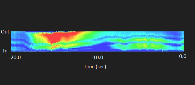
I have tire temp sensors that each record 16 temperature points across the tire, and put that on to CANbus. I’m looking for help with visualisation of that data. I have an idea of how I want it to look, but I’m looking for some pointers to figure the best way to do that. One way, that is really close to what I want, is to use a graph for each temp reading, which would mean 16 graphs per tire. The X axis would be time, but I don’t want the graph to move on the Y axis, only change color. Even when I make the graph have the smallest possible Y height (4) it still is too much and you can see the movement when I ran a simulator on the top 6 lines of 16. I also attached a photo of what I am wanting the end result to look like. I am also open to suggestions for a different way to visualize it.
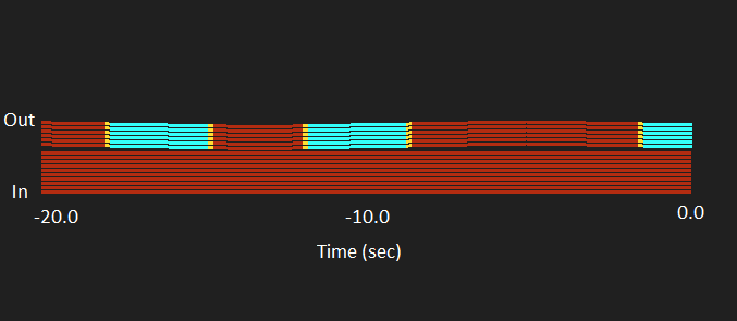
I think I found a decent solution for this. As the Graph Gauge already has everything done for showing data history, I made new option to Graph Gauge called ‘Flatline’. This mode can be used to make the visualization of this type (RPM used in this screenshot):