I have older classic vehicle that I want to design gauges for the dash layout.
The gauges will be based off these style gauges.
Looking for guidance in where to start and what to do.
I am not a graphic artist but I live with someone who is and is excited about designing a dash layout for me.
I assume some type of graphic program is required saw reference to GIMP.
What formats to do we need to save the graphic image in so they can be used by RealDash. Gauge Faces and Needles with animation.
How do we go about doing this project?
For graphics formats, RealDash supports most common ones. We recommend using PNG for transparent images, and JPG for photograph style images. For pre-defined animations you can use MP4 videos or animated GIFs.
To animate gauges based on data triggers, see these instructions:
RealDash-extras/Dashboard-animation-examples at master · janimm/RealDash-extras · GitHub
1 Like
Hmm, but say your using Windows machine to do most the work b4 exporting to a Pi. How do you turn the png into an rd file?
I really like this realdash software but any write ups on how to’s seems very limited for basic things like a custom graphic to then line up with a custom xml.
Cheers
Its not that bad when you just start experimenting with it. To import and use a PNG file:
- Create new dashboard
- Add Image Gauge
- Go to Look’n Feel->Images->Background Image
- Tap the big plus-sign (+)
- Select your PNG file
- Tap Done until back on dash. Then save.
And then you have to write an XML file to be able to set, for example, the number of setpoints on the gauge? So say you want the speedo to go in 20kmph increments from 10kmph to 150kmph. Hence there would be 8 points at which a number would appear on the gauge that would go 10-30-50-70-90-110-130-150.
Or, is there a speedo already available where you can change the number of setpoints and not just the first and last setpoint speeds?
No XML needed of any kind when designing dashboards. XML:s are just for specifying custom connections.
Use a Indicators->Needle Gauge and experiment in Look’n Feel Special->Autoscaling.
Cool. Thanks for that. Navigating new software is always a bit of a trial by error learning experience and some pointers can save a bunch of time 
1 Like
How would I create the numbering to look like the attached image? Would it have to be a custom png file and then have to match the needle scaling to the angles the numbers are in the png? Thanks
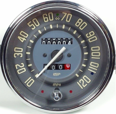
1 Like
I would do that in a way that numbers are static in the image, then use Autoscaling to produce line segments and match to the background.
So I’ve been having a play to try and get the number of segments I want but I can’t see a way to reduce the number of segments from 11. So just like there are 12 segments for an analogue clock then the needle gauges seem set with 11 segments and this doesn’t seem to be able to be changed. Hence why I asked if anything to do with the XML file.
Also, due to being set to 11 segments then if you want the number displayed on the gauge to have a zero at the end means you have to choose a starting and ending speed to align with these 11 segments and there doesn’t appear to be an option to, for example, have the numbers increment in 20KPH from 0KPH to 160KPH over 9 increments (or segments). The autoscaling only seems to change the placement and size of these 11 preset number of segments.
Cheers
- Add Indicator Gauge
- Go to Look’n Feel->Special->Angles & Offsets
- Adjust start and sweep angles to match your background
- Go to Autoscaling and enable “Use Automatic Scale”
- Scroll down and adjust amount of segments and mid segments
- You can also experiment with other settings
This should get you started
Hi there, thanks for the help so far. I’ve managed to get the needle gauges to work with my custom image files but now looking at custom graphics for the water temp and fuel level.
So I’ve attached an image used as the icon for water temp and my idea would be to have the bars either side of the icon appear as the temp increased with colours relating to cold, normal running and too hot along with the water temp icon changing colour.
Is there any way to implement something like this with the gauge options available in Realdash?
Couple of ways come to mind.
- Have multiple images at different stages of bars.
- Make the image bars transparent and add a Bar Gauge behind it. That also allows to use gradient colors etc.
Thanks for the help so far. Another thing I’ve noted is the text graphic, for in my case an odometer readout, pulls each digit to right as it increments. So as an example 45611 would pull the 456 over to the right due to the ones not being as wide as any other digit.
There’s no way in the software to centre the individual digits and I’m trying to recreate the look of the original VW speedo that has the odometer digits spaced apart. Realdash does the character spacing just fine but due to each digit aligning to the right then each digit to the left gets pulled towards the right and hence the digits to the left don’t stay on centre.
Is there any way to fix this?
You can use character spacing to move the digits further apart, it might reduce the effect somewhat
Also, use of Fixed Width Font may help.
1 Like
Mono Spaced Font was the way to go. Thanks guys
1 Like
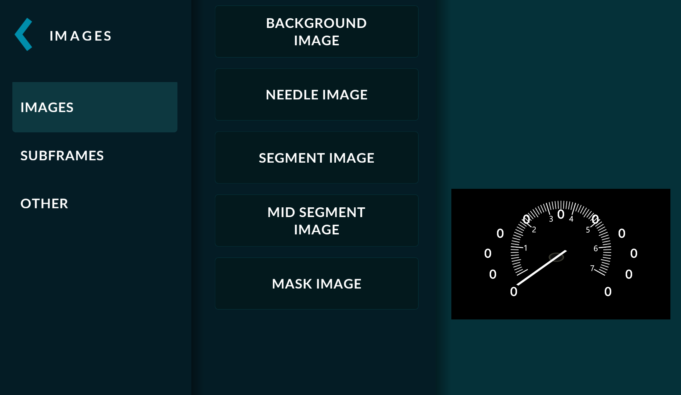
I’m trying to create needle type rpm cluster. What’s going on here? The needle is distorted as its route also. What are those 0,0,0… How can I remove them? How can I know where the pivot point is as it is’t shown any way?
ADD GAUGE
INDICATORS
NEEDLE GAUGE
LOOK N FEEL
IMAGES
BACKROUND IMAGE
NEEDLE IMAGE
Then tinkering without success
SPECIAL
ANGLES N OFFSETS
I’m I doing this wrong?
I really appreciate any help.
It seems like your background image has the scale, so you do not have to use the automatic scale system. You can disable it with:
- Select gauge and go to Look’n Feel->Special->Autoscaling
- Disable the ‘Use Automatic Scale’ option.